
KARLEIGH JUREK NUTRITION
BRANDING
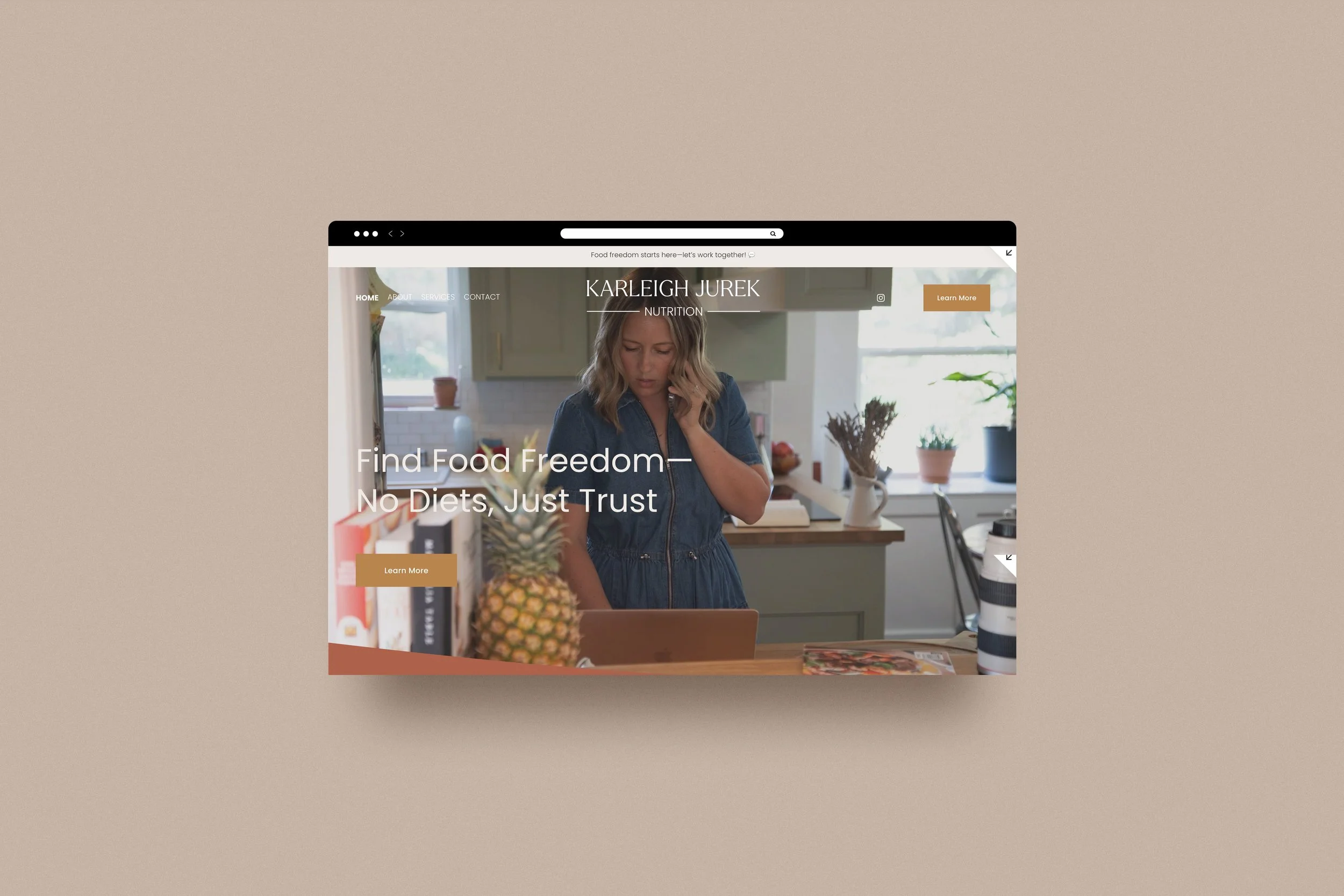
WEBSITE
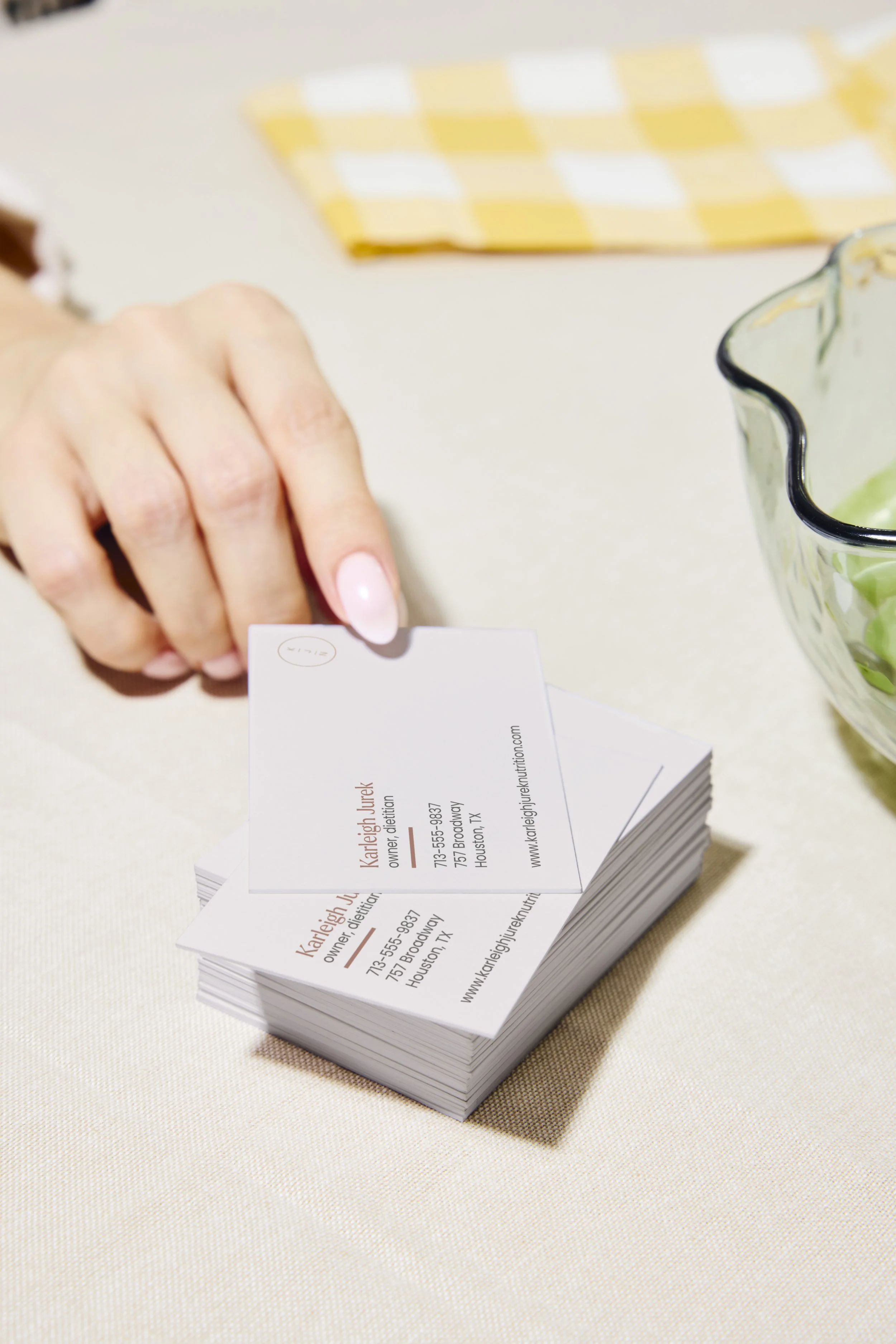
PRINT & COLLATERAL DESIGN
Karleigh Jurek Nutrition was founded out of a deep love for the human relationship with food and Karleigh’s own journey toward food and body acceptance. Karleigh came to me with a vision for her brand but was feeling overwhelmed trying to bring it to life on her own in Canva.
We began with a brand strategy session to clarify her messaging and goals, then refreshed her visuals with a modern, elegant logo. The primary logo pairs a refined serif typeface with a clean, angular sans serif for balance. Circular elements appear in the secondary logo and brand marks, symbolizing the natural cycles we experience in both life and health.
I also developed a tagline that reflects Karleigh’s core belief that no one should feel captive to what they can or cannot eat, while still supporting her clients’ goals. To soften the heaviness of the subject matter, I created a playful pattern of food illustrations that adds approachability. Since her audience is primarily women—especially moms—we anchored the brand in a sophisticated color palette, accented with vibrant pops of color for energy and contrast..


what’s next?
If you’re interested in chatting more about your project, use the button below to apply to work with me. If you’re still on the fence you can shoot me an email at hello@ddcreative.co or send me a DM on Instagram @dd.creative.co, my inbox is always open to answer questions and provide peace of mind. See you on the interwebs!